梵字 4 Sanskrit character 1 siddhamātṛkā, シッダマートリカー
裔円流八法図
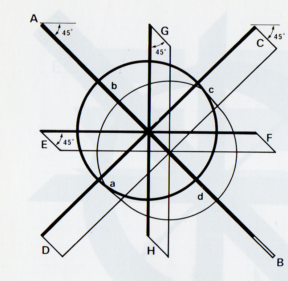
裔円流八法図による基礎練習 と45度に書けていますか(E↓Fの線は、どうしても腕の都合でFのところで45度よりも筆が o 立ちやすいですから注意しましょう)。
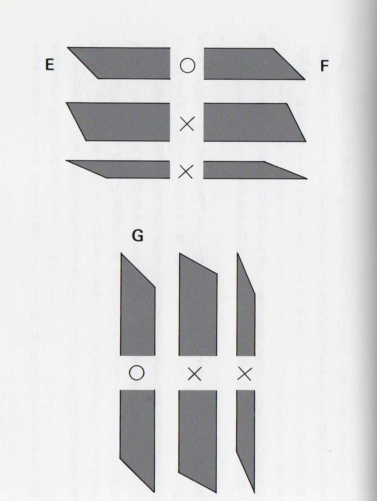
③C↓Dの線は、へりが直角になっていますか。 ④円は、bとdが一番太く、aとcの部分が一番細く(一点で交わる)なっていますか(その ようになっていないと、正しい運筆をしていなかったことになります)。
⑤全体に、かすれやぶれがありませんか。 これらの基本運筆が自由に、ひと息に書けるようになったら、次は、それぞれの交叉部から、いろいろな方向に接続または連続させて書く練習をしましょう。また、その交叉部から逆方向へ筆を入れて接続させる練習もしましょう。これらは、実際に梵字を書くときの大切な基本練習です
さて、以上で八法図による基本運筆は終わりました。こうした基本運筆を繰り返し繰り返し練習しているうちに朴筆に慣れ、自由自在に運筆できるようになります。注意点①墨を筆先につけすぎると、線にムラができて、きれいに見えません。うつわのへりで墨を少し落とし、さらに試し書きをしてから書くようにしましょう。②線のかすれをなくすには、筆が途中で浮かないように何度も練習して筆に慣れることです。書道用の下敷き(フェルト)を用意するか、紙を数枚重ねて下に敷いても効果的です
。③線に、縦じまができることがあります。これは、筆先かぶれるためです。筆を運ぶ方向に少し傾けると、滑らかな線が書けます。円を書くときなどは、どの方向でも滑らかに書けるように、筆を進む方向に少し倒して書くとよいでしょう。何回も練習して自分で力の入れ具合、運筆の速さなど、自分に適した書き方を会得することが大切です。
3、基本点線画の運筆法 朴筆に慣れたところで、実際の梵字を構成する点、線画の基本的な運筆法にはいりましょう。説明図には筆の運びがわかりやすく目に入るように片方に輪郭線を描いてみました。 太い方の輪郭線は、紙面に対して45度に構えた板状の筆先の上部、すなわち左上の先端にあたり圭す。
朴書体梵字は、朴筆の幅が梵字の大きさを決めますから、このことを頭に入れて運筆することが大切です。輪郭線を正しくたどりながら練習してください。
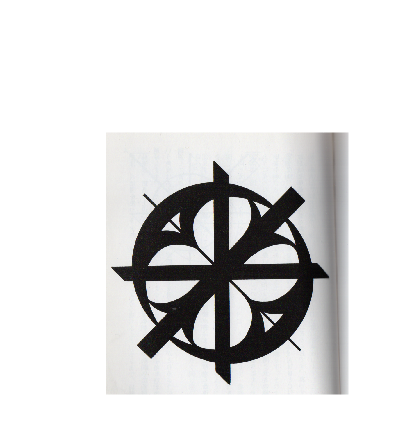
Hachiho-zu
Basic practice with the Hachihozu
Can you write at 45 degrees (E ↓ F line is better than 45 degrees at F
because of your arm?
Be careful because it is easy to stand up).
③ Is the edge of the C ↓ D line at a right angle?
④ Is the circle the thickest in b and d and the thinnest in the a and c
parts (that intersects at one point)?
If it doesn't, it means that you didn't write correctly).
⑤ Is there any blurring or blurring on the whole?
When these basic strokes can be freely written in one breath, the next
step is from each intersection.
Practice writing in different directions or in a row. Also, in the opposite
direction from the intersection
Let's practice putting a brush and connecting. These are important basic
exercises when actually writing the Sanskrit characters.
Su.
By the way, the basic writing by Hachihozu is over. Repeat these basic
strokes repeatedly
As you learn, you will become accustomed to using a simple brush and will
be able to move freely.
important point
(1) If you apply too much ink to the brush tip, the lines will be uneven
and will not look good. Use the edge of the container to reduce the amount
of ink
Let's drop it and write it after trial writing.
(2) To eliminate the blurring of the lines, practice many times so that
the brush does not float in the middle and get used to the brush.
It is also effective to prepare an underlay (felt) for calligraphy, or
to stack several sheets of paper underneath.
③ There may be vertical stripes on the line. This is because the brush
tip is worn. Less in the direction of carrying the brush
If you tilt it, you can draw smooth lines. When drawing a circle, so that
you can write smoothly in any direction
In addition, it is a good idea to tilt the brush slightly in the direction
of travel. Practice many times and put your strength into it, luck
It is important to learn how to write in a way that suits you, such as
the speed of the brush.
3. Basic dotted line art stroke method
Now that you are accustomed to the Park brush, let's move on to the points
that make up the actual Sanskrit character and the basic method of writing
line art.
In the explanatory drawing, I drew a contour line on one side so that the
movement of the brush is easy to understand.
The thicker outline is at the top of the plate-shaped brush tip held at
45 degrees to the paper surface, that is, at the upper left tip.
I'm sorry.
For the Park typeface, the width of the Park brush determines the size
of the character, so keep this in mind when writing.
Is important. Practice while following the contours correctly.